Level and Enemy Design
creating enemies and obstacles
In Twinstick Arcade, you are sucked into an old-school arcade machine. You’re forced to fight your way through crowds of retro-themed enemies, traps, and bosses. The whole play space is projected onto a faux CRT monitor resulting in a curved appearance—scanlines and all. To add to the design challenge, the game uses a restrictive colour palette consisting of four different shades of green (plus white for critical UI elements). Designing the enemies and bosses of Twinstick Arcade was a challenge. They needed to be easily visible against the green play area while also looking visually distinct from the foliage and ground textures.
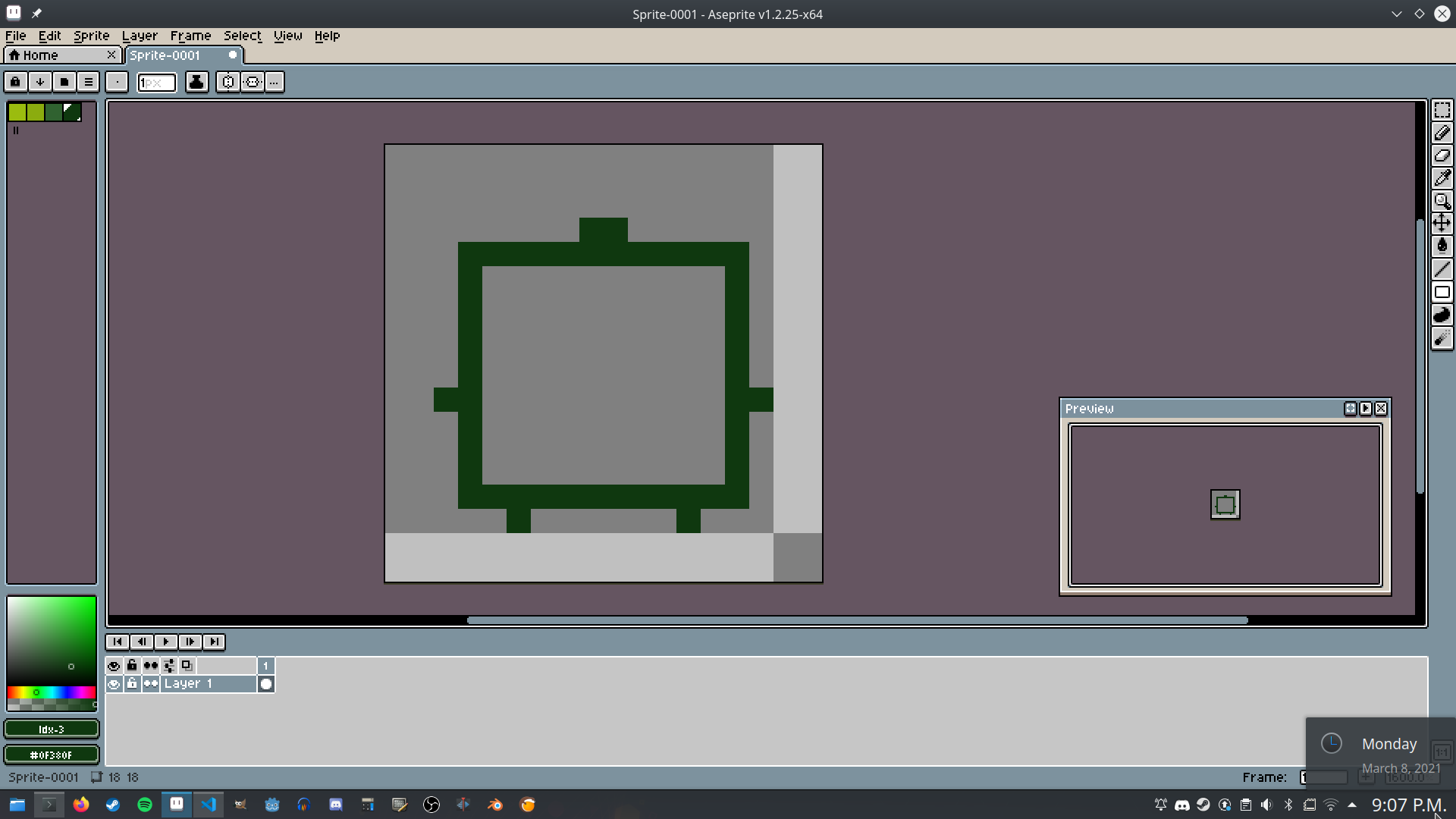
Both enemies and bosses were blocked out in a dark green and then filled in. They’d be placed onto a sample play area to ensure they’d be easy to see. All enemies, bosses, and projectiles were given an in-game light source too.
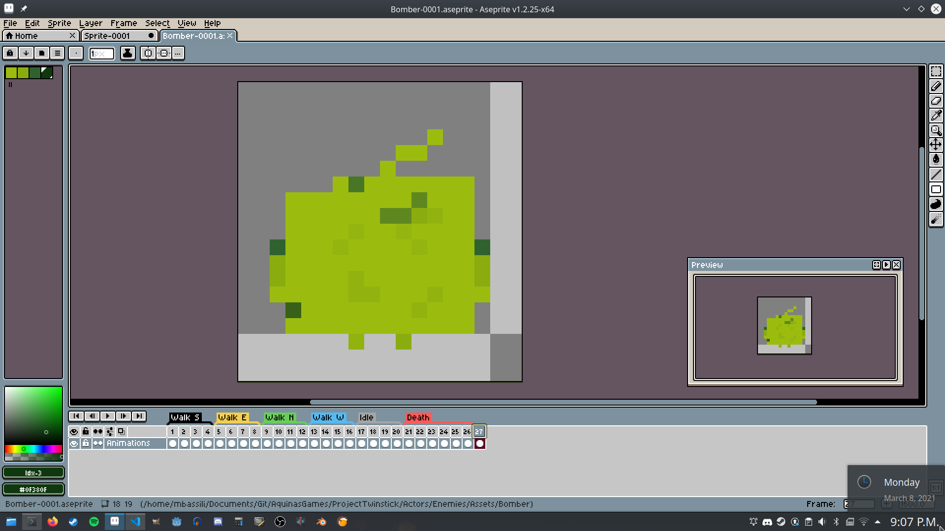
From there, facial features and distinguishing details would be added. Every in-game actor has dozens of animations and poses, all based off this initial design.
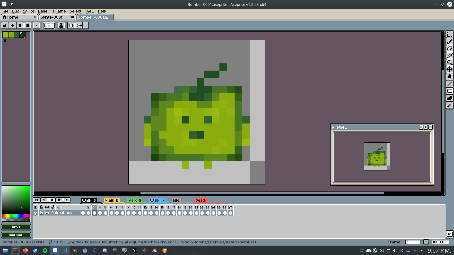
Once key features were done, we’d finish off by adding uneven, random shading to all faces. Conventional wisdom says to define a light source and shade accordingly, but I found that randomly distributing pixel shading looked better with our faux-CRT effect. The result: a pixelated yet readable enemy.
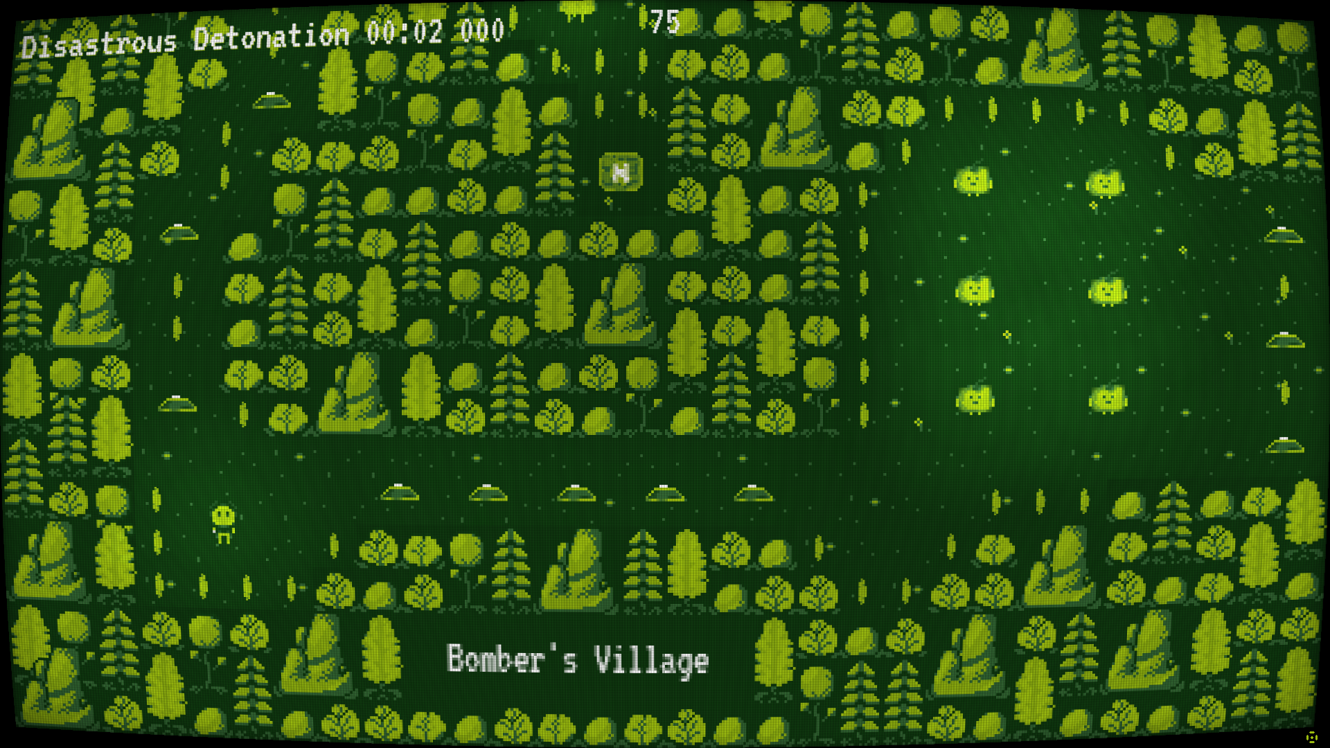
The in-game scanlines try to match the pixel rendering on actors in real-time. The aim was to get the game to look like a 21st-century version of old 80s hardware and I’m pretty happy with it. It’ll probably get tweaked a bit more before release.
crafting levels and combat encounters
My goal with the level design was to inject some 90’s shooter blood into my 2D arcade gunner. The easiest way to do this was to treat every level like a maze (but unlike those old 3D Realms shooters, Twinstick Arcade does not have keycards). Most levels are 1920 pixels wide and 1080 pixels high. Your character is only 18 pixels tall and wide, so the camera zooms down to their level. This gives me a lot of space to design interesting and confusing mazes.
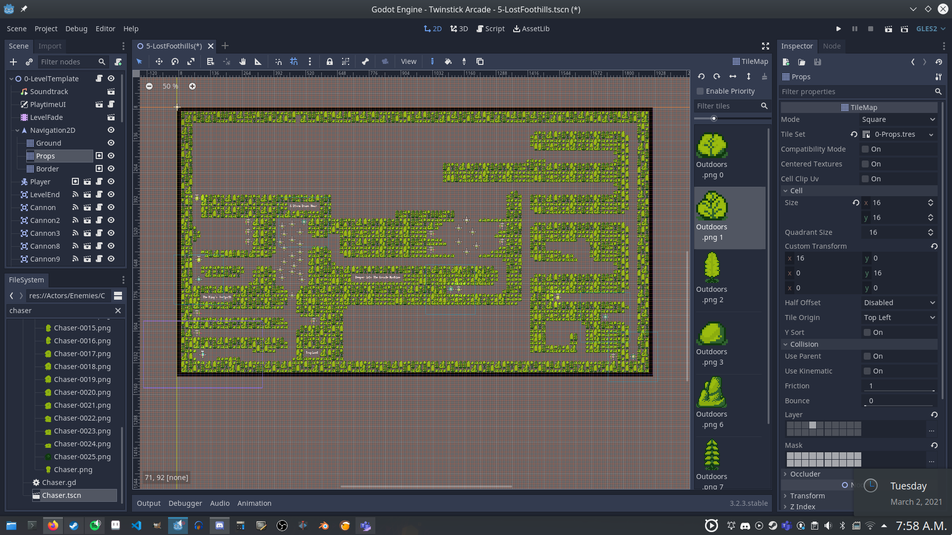
I start by creating a border around the map. The CRT shader sets its size and shape based on the size and shape of the surrounding border. This method of dynamically configuring the CRT shader means that I can be flexible with the size and shape of levels (eg. boss levels are often a different size and shape to regular levels). Once a border is drawn, I can plop down the Player instance and an exit somewhere onto the map and get to work. First, I’ll block some areas off in the play space. In each of these smaller sub-areas, I’ll start playing around with some maze-like paths. Every once and a while, I’ll add a combat encounter. This is unflatteringly referred to as “anal-bead level design” and I think it’s an apt description.
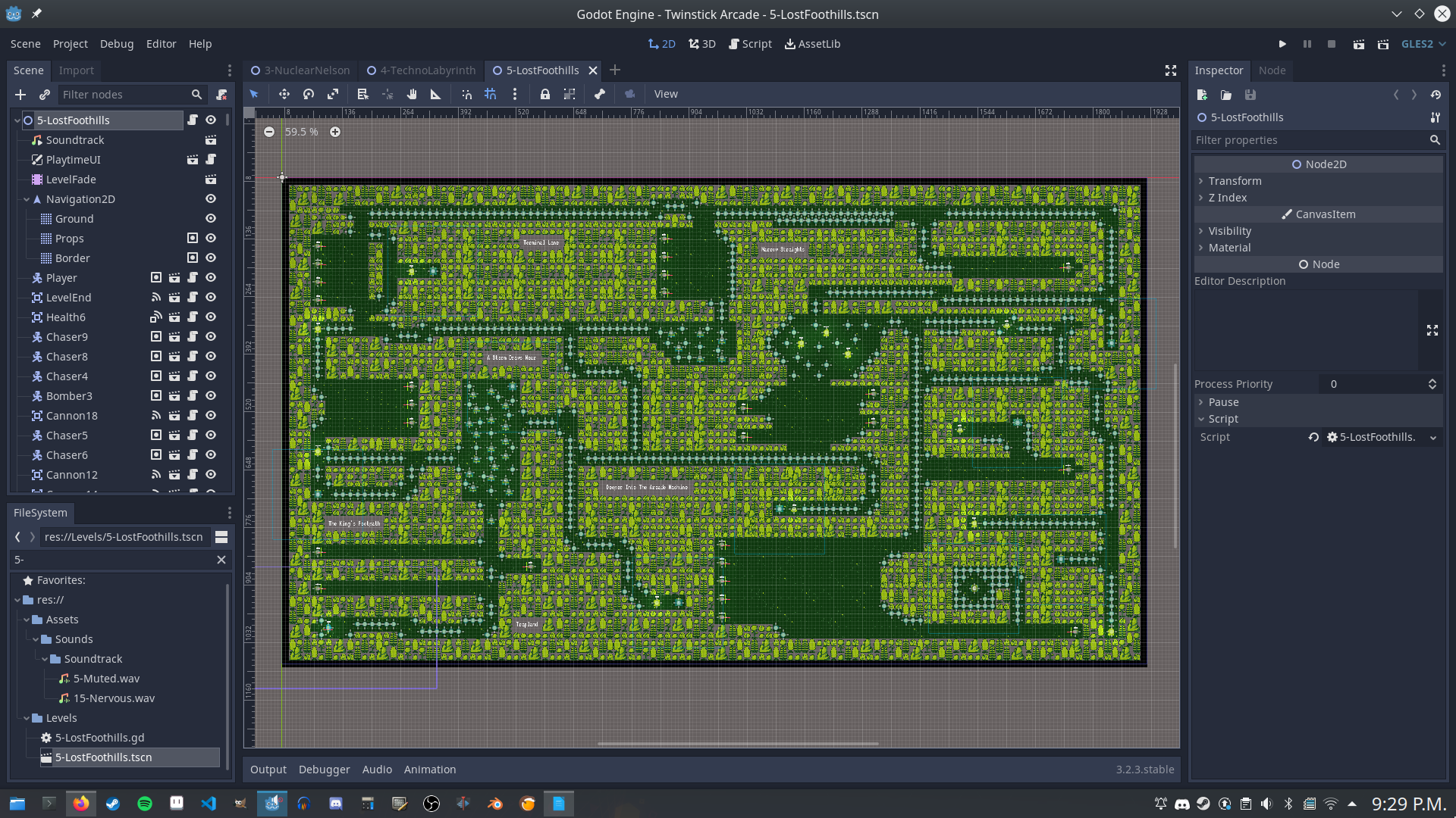
Sections of paths and mazes are swapped out for sections of the map designated as combat encounters. I’ll also try to sprinkle traps around the world so that the player is forced to check their surroundings. Holding the right mouse button zooms the camera out so that you can see most of the play area; traps can easily be avoided if you are paying attention.
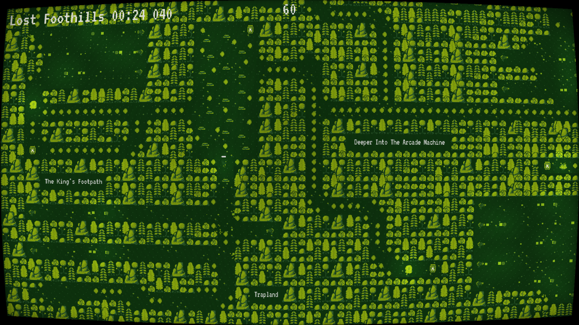
Combat encounters are staged such that the player can’t bait enemies out from a distance. I try to block visible access to combat areas by hiding them behind trees or tucking them away behind projectile traps. This means the player can’t just hold down the left mouse button and dash through the level. They pushed to engage with enemies and plan out their attacks. The player character deliberately has very little health which will hopefully prevent players from simply dashing through the game.